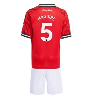
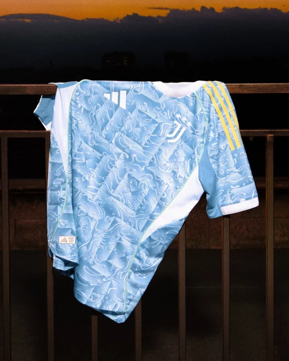
The new Juventus away jersey for the 2025/26 season was released worldwide on 13 June and premiered on 18 June at the FIFA Club World Cup. This away jersey uses a refreshing blue as the main colour and gives the Zebra Army a cool summer look.
Design concept: Mediterranean summer style
This Juventus jerseys characterised by a refreshing shade of blue, inspired by the blue coast of the Apennine Peninsula, and reflected in the flowing sea-water pattern that mirrors the sparkling waves of the Mediterranean.
The iconic three Adidas stripes on the sleeves are adorned with luminous yellow and recall the swaying lemon trees and the blue sky of Italy. The classic white round neck completes the overall look – clear and simple, without losing simplicity and elegance.
Moreover, the jersey uses a “multi-drop pattern” with square photo frame details to capture summer memories like a photograph. Each ball touch seems to reawaken the moment of the sun-kissed Mediterranean. Designer Jürgen Rank said this is not only an aesthetic exploration but also a homage to the Italian spirit of the “romantic summer”.
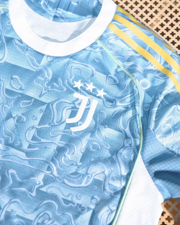
Colour-tone features: Ash blue × Pearlescent
The official definition of the colour combination reads “Ash blue + Pearlescent + White”.
The grey-blue appears steady and romantic, the white logo is a focal point, and the pearlescent yellow adds vitality to the overall image. The light blue short sleeves emphasise the bright three stripes and create a fresh, translucent atmosphere – perfect for summer stadiums.
Performance and comfort are equally important
The player version of the jersey features an advanced woven structure for improved breathability and sweat absorption. The fan version uses AEROREADY material, which absorbs moisture efficiently and wicks sweat away, providing daily wearing comfort.
The white round neck and the area with the three stripes are reinforced to ensure durability and fit. Both players and fans enjoy a refreshing feel when wearing it.
Cultural significance
The Mediterranean theme underlines the cultural leitmotif of the “Italian summer”. The combination of urban traditions with natural beauty enhances brand awareness.
Juventus Turin has transferred the Italian cultural features of this occasion to the jersey design and thereby reflects the club’s pursuit of a balance between cultural heritage and modern design.
Fan feedback
Some fans think: “This jersey looks like it’s made for surfing” – a jersey suitable for surfing.
Others commented: “It looks cheap” and “It feels like a Lazio jersey” – they find it too ordinary and not symbolically meaningful.
It is evident that there is a degree of resistance between fans' preference for the traditional Zebra style and the design that seeks to prevail.
Summary
The Juventus away jersey for the 25/26 season uses artistic techniques to integrate the Italian summer style into the design. Whether through colour, pattern or material – it testifies to the designer’s clever spirit. Although some fans fear losing the traditional style, this reflects Juventus and Adidas’s desire to be innovative while respecting history.
For fans who prefer a fresh style, this is a real eye-catcher. affordable football jerseys Whether on the pitch or in everyday life in the hot summer – experience the Italian romance of the 'Zebra Army'. Do you believe this away kit could become Juventus's 'Explosive' material next season?


